Instead, I've been putting some pictures on the H10 and seeing how viable it is as a portable photo album. Since the H10 does not seem to make particularly inspired or functional use of colour or animation in it's music and menu features (beyond menu backgrounds in colour which seem to be non-customisable), the photo album seems to be the best way to justify the functional advantages of using a colour screen.
Here's a comparison between the display on the H10 (left) and on the 2 1/2 year old Canon Digital Ixus V2, the camera with the smallest display I have (Right).

The picture is actually doing the iRiver a favour as the exposure to get the iRiver image 'true' required that I wash out the Canon slightly. I'm sure I can capture it better, but it's the best I can do now. It also has to be said that the difference with the naked eye is more acute. The question is, how useful is this, given the quality and that you can't zoom into the image? My answer would be "less than useful". It seems to be one of those ill-considered features for the sake of it, to please the geeks... something that iRiver seems to make a habit of. However, it could be that my screen is broken as text is distinctly fuzzy on the screen (in a first-generation colour mobile phone sort of way).
The H10 is an attractive player which I obtained in the understated blue. iRiver's design has matured considerably and this shows none of the bad-taste excess / lack of inspiration of the previous hard-disk players from the company. It is just a little thicker than the iPod Mini at some points along the player, while being thinner than the Creative Zen Micro. Like the iPod Mini, it does not spoil the lines of your suit as much as the Zen when living in your jacket pocket.
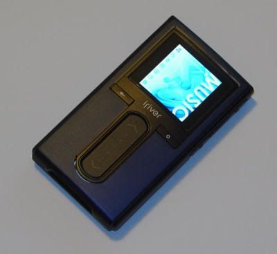
It's a very nice looking player.You may not be able to see it, but there's a subtle chrome trim on the edges of the touch panel and the display. The menu system at the root clearly shows what mode you're in.
Unlike the Zen Micro, the buttons aren't illuminated. Neither is the control strip.
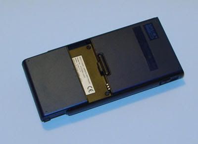
The H10 reduces it's thickness despite offering replaceable batteries by making the battery part of the case.

Selecting Music brings up the usual options, and allows you to navigate through to a track listing...
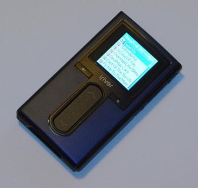
Notice the alphabetical presentation of the tracks, even though the files are correctly tagged.
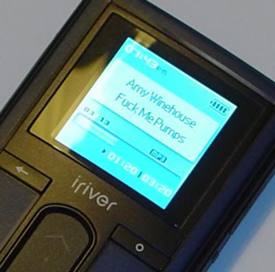
The H10 displays a good amount of information while it's playing.
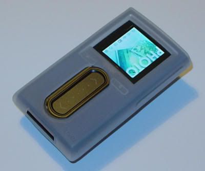
The DLO Jam Jacket-style case (although it doesn't have screen protection) is a welcome bonus.
That's it for the moment. I'll write more when my issues have been addressed.
No comments:
Post a Comment